|
Part 29 - Combining Images
|
|
December 2006 Magazine
|
|
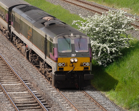
The previous two articles in the Digital Photoguide series have shown how railway photographers can benefit from using techniques to combine multiple images into a single final image. They also explained the right way to take the constituent images and described some suitable software for stitching the pictures together. This month features a detailed example showing how to use PTGui stitching software. The two separate “Before” and joined “After” images are shown below.
|
|

|
|
The printed magazine explains how to use PTGui through all stages as far as creating the merged image. Unfortunately the “automatic merge” mode of PTGui creates a final image where the train is partially hidden ! By using manual methods in Photoshop - editing the mask - the train can be made visible.
|
|
Shadow
In the original “too late” image the shadow in front of the train has been cut off. In the final image the missing piece of the shadow must be simulated. There was insufficient space in the printed magazine to explain this part so it will be described here. The principle used is to darken the desired area sufficiently to look like a shadow. This is achieved using a Curves Adjustment Layer. the Curves Adjustment Layer feature is included in full Photoshop but is not available in standard Photoshop Elements. Fortunately Elements users can add a limited-functionality Curves Adjustment Layer using the software and instructions available elsewhere on this site in Part 12.
The “Before” and “After” pictures are below. Hold your cursor over the picture and watch the truncated shadow change into a full shadow.
|
|
|
|
The curve that created the shadow is shown below.
|
|

|
|
To limit the shadow to just the desired are requires the use of a mask. The way to create the mask is select the shadow area roughly before creating the Adjustment Layer. It can be corrected later. Below an enlarged version of the Layers Palette is shown. Note how the mask on the Curves layer is mostly black with just a small white area where the shadow is.
|
|

|
|
When you modify the mask you change the way the shadow looks. To make the shadow darker the mask must be less black in that area. To do this, select the mask by clicking on it. The layer will go blue and the small box to the right of the “eye” symbol will go grey with a white circle in it - exactly as in the Layers Palette above. To alter the mask draw on it using the paintbrush or the eraser. If you use a “soft” brush it will have edges that cause the painting effect to be gradual. This allows you to merge gently with what is already there. To apply less paint, set the opacity value to much less than 100%. For example using 8% will alter the shadow very slightly. Don’t forget to set it back to 100% later. By using the paintbrush and eraser tools to edit the edges and “strength” of the mask you can get the shadow looking right. (The author would not claim that his shadow looks totally convincing when enlarged, but you can see the general effect. A little more work would improve it). Below you can see the mask for the whole picture. Where it is fully red the Curves Adjustment Layer has no effect. Where it is black it has some effect - the more black, the more effect. If you put your mouse cursor over the image you can see it change to the final image.
Many people are confused about what masks are and how they work. Hopefully this example will clear the confusion. If you have a question, contact the author.
|
|
|
|
Part Twenty Eight
|
Part Thirty
|


